
Indicators of Australia’s welfare
Indicators are simple statistics that summarise often complex issues. Most indicators serve as sentinel indicators for the topic they represent; that is, they are useful to highlight particular results in an area of interest and help people to ask questions about why the result is as it is.
Australia's welfare indicator framework
Australia's welfare includes an indicator framework based on 5 domains and 19 themes, shown here, and has 61 indicators.
A wellbeing domain was included for the first time in Australia's welfare 2017. It incorporates 7 themes, as shown here, and 15 indicators.
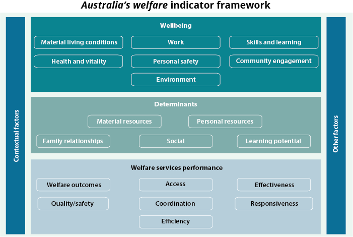
Find out more: Chapter 9.1 'The Australia's welfare indicator framework' in Australia's welfare 2017.
What's trending
Trend data are presented for indicators wherever possible. Some examples are presented here.
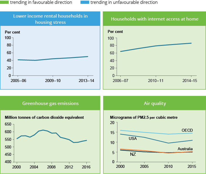
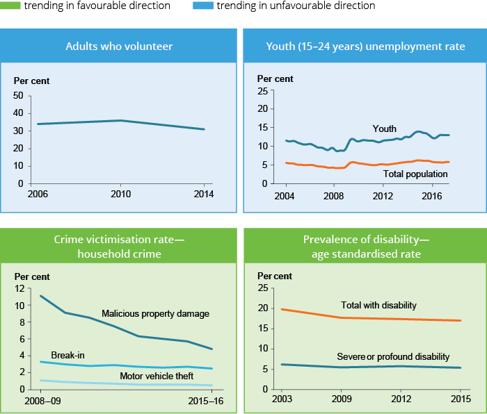
Find out more: Chapter 9.2 ‘Indicators of Australia’s welfare’ in Australia’s welfare 2017.
Wellbeing—Australia's ranking on global indexes
There is a lot of international interest in wellbeing, including 'subjective wellbeing' or 'happiness'. Several summary measures are used to compare how countries are faring. An objective and a subjective measure are presented here.
Australia performs exceptionally well on the objective measure, the Human Development Index, which aggregates achievement in life expectancy, education and standard of living. We also rank highly on subjective wellbeing (happiness), when asked to evaluate the quality of our lives on a scale of 0 to 10.
| Measure and year | World best | Australia | New Zealand | Canada | USA | UK |
|---|---|---|---|---|---|---|
| United Nations Human Development Index 2014 | Norway | 2 |
10 |
9 |
8 |
14 |
| World happiness report 2017 | Norway | 9 | 8 | 6 | 14 | 19 |
Find out more: Chapter 9.1 'The Australia's welfare indicator framework' in Australia's welfare 2017.
Highlighting data
Putting data together to tell a bigger story
In today's world of 'big data', governments, businesses, the community and individuals have access to an unprecedented volume and variety of data, at an ever-increasing rate.
The Productivity Commission's Inquiry on Data availability and use highlights the critical importance of using data to achieve positive social and economic outcomes and of working closely with the community to obtain 'social licence' to support this endeavour.
The person-centred data model illustrated here recognises that many factors affect a person's interaction with health and welfare services and supports. Making the most of available data across the full spectrum of health and welfare activity offers an opportunity to produce more meaningful, person-centred information. This evidence can provide a basis for better policy decisions and, ultimately, produce better outcomes for the Australian population.
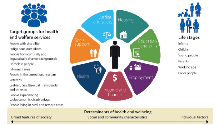
Find out more: Chapter 1.7 'Understanding health and welfare data' in Australia's welfare 2017.
There's always more to do!
Even with our best efforts, there are gaps in health and welfare data. For instance, data to understand a specific area of interest may not be collected. Further, major items may be missing from existing data collections, or not collected by all providers.
Gaps in data and evidence include:
- prevalence data; for example, the national prevalence of child abuse and neglect in Australia
- risks and drivers of specific behaviours and actions (such as family, domestic and sexual violence)
- meaningful outcomes data for people who receive, and agencies that fund, health and welfare services; for example, long-term outcomes for children in out-of-home care
- unmet demand for services; for example, disability services
- data on pathways and transitions within and across different service types, such as in and out of social housing, or because of being a victim of domestic violence
- comprehensive data about the welfare workforce on which to base decisions about future requirements.
The AIHW works closely with data providers to make better use of existing data and identify and prioritise data gaps across a range of sources.
Filling the gaps
The AIHW is working to fill data gaps in several areas, including by:
- communicating directly with regional service agencies, such as Primary Health Networks, to identify specific gaps in information at the local level, along with strategies to fill them
- developing data clearinghouses in areas such as aged care, and family and domestic violence. This can help to coordinate national reporting, provide a platform for improving data scope and quality and facilitate researcher access to data
- using data linkage to enhance the value of existing sources to produce new and meaningful outcomes in a range of areas. This strategy offers potential to do much more.
Find out more: Chapter 1.7 'Understanding health and welfare data' in Australia's welfare 2017. Also, see the 'What is missing from the picture?' sections throughout the main report.