Leading causes of disease burden

Ranking diseases by burden shows the leading causes of health loss for the Aboriginal and Torres Strait Islander population. Changes in rankings over time may be due to changes in disease prevalence, epidemics or changes to how causes of data is collected, reported or coded.

In this interactive graph, leading causes of death and disease burden (YLL, YLD or DALY) can be ranked by the number or by the age-standardised rate (ASR) in the population.

Note that an increase in rank over time does not always mean the disease or injury has increased in the population, and vice versa. Therefore, changes in ranking of causes of deaths and disease burden over time should be interpreted with caution. In addition, leading causes of death in this data visualisation is based on Australian Burden of Disease Study 2018 methods and will not be comparable to other reports of leading causes of death due to modelling and cause of death alignment to diseases.

Use the ‘Rank by ASR’ interactive graph to explore the leading 25 causes of disease burden (YLL, YLD or DALY) among Indigenous Australians for 2003, 2011 and 2018, or the ‘Rank by number’ interactive graph to explore rankings by number of YLL, YLD or DALY. The ‘Rank by number’ graph ranks diseases/injuries using raw numbers that have not been adjusted to take into account population age structure. The ‘Rank by ASR’ graph ranks diseases/injuries by age-standardised rates which take into account differences in population age structure and allows for more accurate comparisons.

See Chapter 7 in the Australian Burden of Disease Study 2018: impact and causes of illness and death among Aboriginal and Torres Strait Islander people report for more information on changes over time in disease burden.
 

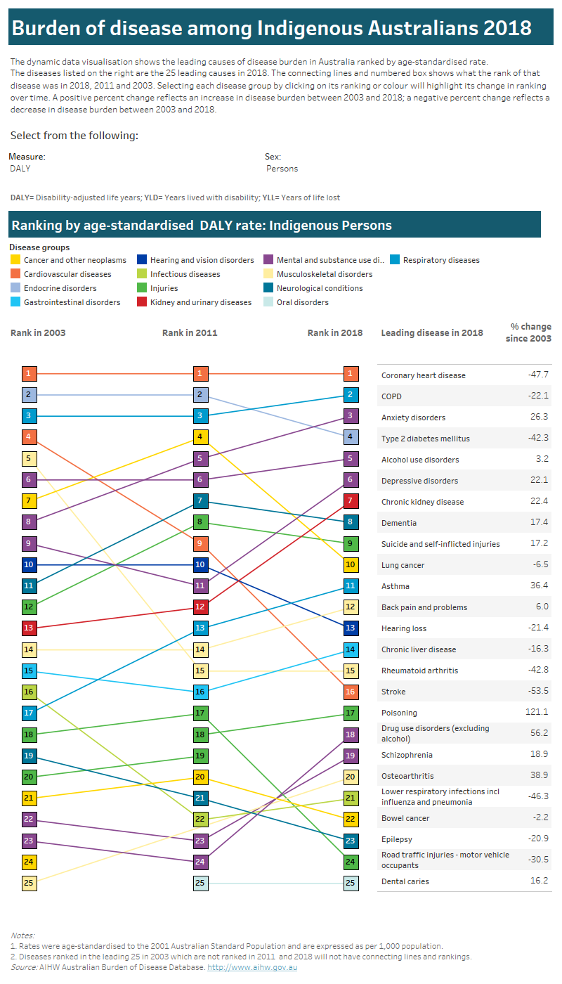
Tab 1: This interactive data visualisation compares changes in the ranking by age-standardised rate of burden for the 25 leading causes of disease burden among Indigenous Australians in Australia over time for the years 2003, 2011 and 2018. The visualisations can be customised to report data according to sex and type of burden. Four vertical columns show the leading causes of burden in each year for the selected sex and type of burden. Each disease or injury is represented with a square shaded according to the disease group the disease or injury belongs to. Horizontal arrows between the squares show whether there was a change (increase or decrease) or no change in the ranking by age-standardised rate of burden over time. On the right there is also a table which lists the per cent change in burden between 2003 and 2018 for each of the leading causes of burden in 2018 for the selected sex and type of burden.

Tab 2: This interactive data visualisation compares changes in the ranking by amount of burden for the 25 leading causes of disease burden among Indigenous Australians in Australia over time for the years 2003, 2011 and 2018. The visualisations can be customised to report data according to sex, age group and type of burden. Four vertical columns show the leading causes of burden in each year for the selected sex, age group and type of burden. Each disease or injury is represented with a square shaded according to the disease group the disease or injury belongs to. Horizontal arrows between the squares show whether there was a change (increase or decrease) or no change in the ranking by amount of burden over time. On the right there is also a table which lists the leading causes with respect to the amount of burden caused in 2018 for the selected sex, age group and type of burden.

Please use the ‘Download’ button at the bottom of the dashboard to generate image or PDF versions of the data.