Cancer survival by age visualisation
This cancer survival visualisation contains three figures. The visualisation presents statistics for the selected cancer and provides statistics by sex.
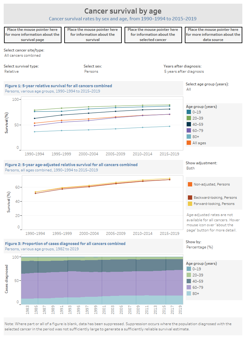
Figure 1 is a line graph that contains time series information on 1 to 5-year observed or relative survival rates for the selected cancer in 5-year periods for selected age groups (0–19, 20–39, 40–59, 60–79, 80+) and all ages.
Figure 2 is a line graph that contains information on 1 to 5-year observed or relative age-adjusted survival rates for the selected cancer in 5-year periods. Age-adjusted rates are shown for backward-looking and forward-looking adjustments. Please read Cancer data commentary C6 for more information about age-adjusted survival and the backward-looking and forward-looking survival data.
Figure 3 is a stacked bar chart that contains the number of cases diagnosed for the selected cancer from 1982 to the most recent year available for reporting, at the time of release, for the age groups: 0–19, 20–39, 40–59, 60–79, 80+. The chart can be shown as the number of cases diagnosed or as a percentage for each age group of the total cases diagnosed.
The visualisation includes information about many different cancers and the statistics within this visualisation are available in Excel format within the Data section of this report.